For a lot of talented creatives in the industry, their portfolios do not properly represent or show the quality and skill of their work due to the lack of design and functional consideration that went into making their portfolio website. I cannot count the amount of times I've met amazing and talented people, all of which had a portfolio but not only was it just a boring template, it was never anything unique, cool or creative. For some of these people and personalities, you have this amazing work but a dim, poorly functioning website to go along with it. This is what I wanted to change, by creating something that viewers and employers can look at and instantly say to themselves "Wow, this is unique & cool".
Rough Beginnings
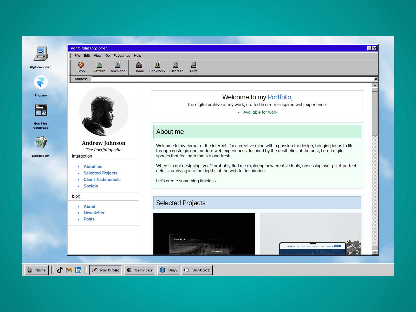
This design idea & concept first originated as a project for college, where I had the idea to create an OS styled container to host my project (which by the way earned me the best grade possible - and the design of my first iteration accounted towards the grade). I created this projected in a page builder called Readymag, which is an almost drag and drop website editor allowing you to build websites like its Photoshop.
Issues & Concerns
Not only was this website NOT responsive, it was only available on one size, and this was the Desktop breakpoint of this project meaning 60 percent of people were not able to access this project (60 percent of users view websites on the phone). Each graphical element on the website were large, unoptimized images, leading to large loading times and a poor user experience. As well as that, majority of the elements had to be drawn in the program called Aseprite, which is a pixel art program & the navigation was built with invisible navigation boxes on top of the image to navigate through the website.
Worst of all, this wasn't a template. People couldn't use this as their portfolio so my main goal with this project was come back to this project, use a better website builder, make it responsive and allow for people to add their own content.
As this was an old project meant to be converted to a template, I obviously wanted to add more to this project, as I was heavily limited to the tools that the website builder offered me. I could ramble all day about the changes, design inspirations and improvements that were made to this project but that's not interesting, bullet points are however:
Responsive Navigation & Window - Utilizing multiple layers of shadows, each border that meant to change size now became responsive, improving UX and performance as large images covering portions of the screen were not needed anymore
Recreated old well-known websites into useable pages - Taking inspiration from the old Wikipedia Designs & old Facebook pages, I included these two designs of websites into this template to make the project more memorable and have potentially a more older generation viewing the website (like employers) be familiar and recognise portions of the website, relatability = improved trust)
Included a Blog & Project CMS, allowing the template user to manage a majority of the website simply through content management systems, which is important for a useable template.
SEO & Performance Optimized - Unlike the previous project, this project has built in SEO and each image is optimized to run smoothly on every device, apart from smart fridges.